I’m not a web developer, but i am awed by the visualization that can be accomplished within a web browser. And, i don’t normally browse the web looking for cool visualizations until i actually need something.
(There are updates to this post in a new blog here)
Recently, i was looking for simple, intuitive ways to display budget information related to projects, sections, and employees. I came across these sunburst plots (particularly the one with labels by metmajer) that utilize something called d3.
So i set about attempting to create the desired json file using my favorite programming language. After wrestling a bit, i found some slick code in javascript to create such a file, and proceeded to convert the code to python. Now, because of my normal interest in water resources, i thought it might also be a good visualization tool for water budgets. A quick search for ‘water budget table’ turned up a report from the USGS on the Black Hills area, with a nice summary table of inflow and outflow to various aquifers in the study.
Copying the data to a .csv format (for quick and easy access) allows the code to read as a pandas dataframe, and export to the desired json file. A bit of javascript and we have something like:
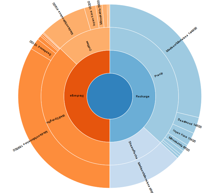
And of course, the really cool part is – the plot is interactive! – so if you choose any of the components, the plot morphs to emphasize that particular piece. try it out here.
Now, how to put it together:
there’s some python on my github to create the json – and the example csv file from the USGS report. After downloading or cloning, you can execute the class like
import pandas as pd
import df2json as dj

def blackhills():
 df = pd.read_csv('blackHillsBudget.csv')
 jm = dj.jsonMaker(sql='', jsonfile='blackhills.json')
 jm.writeJSON(df=df)

blackhills()
note: the jsonMaker class actually uses the last 2 columns – the first is a label for the pie, the second is the value used to determine the size of the piece of pie.
then, some javascript (modified to remove labels that are in very small arcs) –
(UPDATE: i’ve recently had some issues with wordpress removing part of the javascript or jumbling the code in the example below – you can also see a copy of the code at my github).
var width = 960,
    height = 900,
    radius = Math.min(width, height) / 3;

var x = d3.scale.linear()
    .range([0, 2 * Math.PI]);

var y = d3.scale.linear()
    .range([0, radius]);

var color = d3.scale.category20c();

var svg1 = d3.select("body").append("svg")
    .attr("width", width)
    .attr("height", height)
    .append("g")
    .attr("transform", "translate(" + width / 2 + "," + (height / 2 + 10) + ")");

var partition = d3.layout.partition()
    .value(function(d) { return d.size; });

var arc = d3.svg.arc()
    .startAngle(function(d) { return Math.max(0, Math.min(2 * Math.PI, x(d.x))); })
    .endAngle(function(d) { return Math.max(0, Math.min(2 * Math.PI, x(d.x + d.dx))); })
    .innerRadius(function(d) { return Math.max(0, y(d.y)); })
    .outerRadius(function(d) { return Math.max(0, y(d.y + d.dy)); });

d3.json("https://raw.githubusercontent.com/fluidmotion/visTools/master/examples/sunburst/blackhills.json", function(error, root) {
    var g = svg1.selectAll("g")
        .data(partition.nodes(root))
        .enter().append("g");

  var path = g.append("path")
    .attr("d", arc)
    .style("fill", function(d) { return color((d.children ? d : d.parent).name); })
    .on("click", click);

  var text = g.append("text")
    .attr("transform", function(d) { return "rotate(" + computeTextRotation(d) + ")"; })
    .attr("x", function(d) { return y(d.y); })
    .attr("dx", "10") // margin
    .attr("dy", ".35em") // vertical-align
    // http://stackoverflow.com/questions/24547620/zoomable-sunburst-with-labels-issue
    .attr("visibility", function(d) {
         return d.dx = d.x && e.x < (d.x + d.dx)) {
            // get a selection of the associated text element
            var arcText = d3.select(this.parentNode).select("text");
            // fade in the text element and recalculate positions
            arcText.transition().duration(750)
              .attr("opacity", 1)
              .attr("transform", function() { return "rotate(" + computeTextRotation(e) + ")" })
              .attr("x", function(d) { return y(d.y); })
              .attr("visibility", function(d) { return d.dx/total < 0.01 ? "hidden" : "visible"});
          }
      });
  }
});

d3.select(self.frameElement).style("height", height + "px");

// Interpolate the scales!
function arcTween(d) {
  var xd = d3.interpolate(x.domain(), [d.x, d.x + d.dx]),
      yd = d3.interpolate(y.domain(), [d.y, 1]),
      yr = d3.interpolate(y.range(), [d.y ? 20 : 0, radius]);
  return function(d, i) {
    return i
        ? function(t) { return arc(d); }
        : function(t) { x.domain(xd(t)); y.domain(yd(t)).range(yr(t)); return arc(d); };
  };
}

function computeTextRotation(d) {
  return (x(d.x + d.dx / 2) - Math.PI / 2) / Math.PI * 180;
}
hope this is helpful for other pythoners out there. lemme know.
